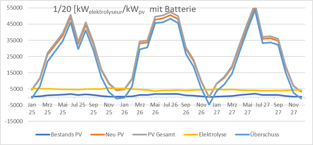
The image is a line chart illustrating various data points over a timeline from January to November. The y-axis represents values measured in kW regarding electrolyzers and batteries. It includes categories like Bestands PV – existing PV, Neu PV – New PV, PV Gesamt – PV Total, Elektrolyse – Electrolysis, and Überschuss which means excess. The chart shows fluctuations of these metrics across the specified dates.